Source: https://www.youtube.com/watch?v=O8i7OKbWmRM&ab_channel=BlenderGuru
Imagine when you buy a story book, you open it only to realize that the pages were out of order. The text was hard to read, and the story rambled on with no sense. That’s exactly the same as a badly composed photograph.
Composition, what does it exactly mean in graphic design?
Composition is about arranging elements in a scene in a pleasing and easy-to-read manner. When done correctly, it guides the viewer to what’s important and is overall resulting in a more pleasing and aesthetic looking image.
In fact, composition is one of the most important things that you could learn as a CG artist. A lot of people is talking about, but almost none explains it clearly, which is why I’m writing this post.
A CG Artists Guide To Understanding Composition
By the end of this post, you will have learned how to correctly position the elements of your scene to make an image that’s visually attractive and wows your audience.
Composition can best be broken down into three stages, which will address throughout this post.
- The focal element
- The structure
- Last, the balance.
The Focal Elements
Let’s start with the first one, the focal element.
The focal element is something that the viewer is drawn to immediately upon seeing the image. When an image is badly composed, generally, the biggest culprit is the lack of a focal element. Or there is too many focal elements. Focal elements are so vital to a scene because without it, the view is left bouncing around the image, wondering what on earth the whole point is.
An example of no focal point
This is an image I made here a few years ago. Look at this and you go, great, a brick wall. Thrilling, now what? What are we supposed to focus? On the door? Is that what’s interesting? That’s the only thing that stands out here. There’s nothing here, nothing. It’s just a brick wall. You end up reaching for that close button as quickly as you can, because it’s a waste of time. There’s nothing here other than it’s a brick wall.
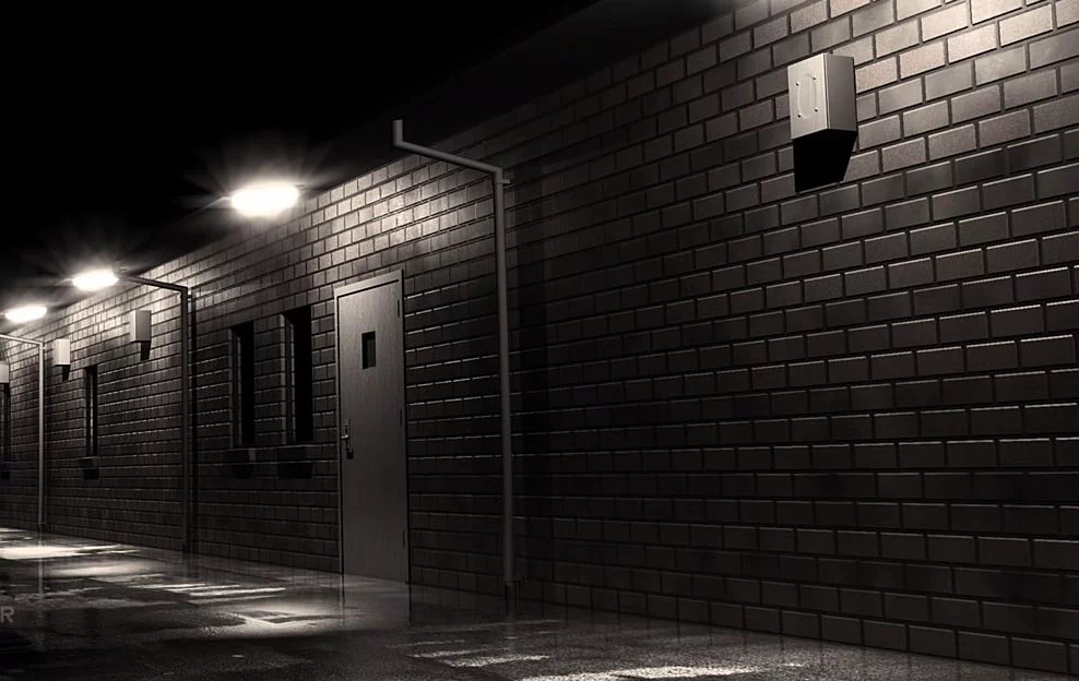
I put all my time into texturing, lighting, getting the perspective. And all that stuff was a complete waste of time, because I didn’t bother to put a focal element in. This image is likely to get closed within seconds by the majority of people that have a look at it.
On the other hand, if you had like a little guy standing here with arms folded and little hoodie on in the background, that would be a focal element. That will be something that would get your attention. But as it is, there’s nothing there. So it’s just bland and boring.
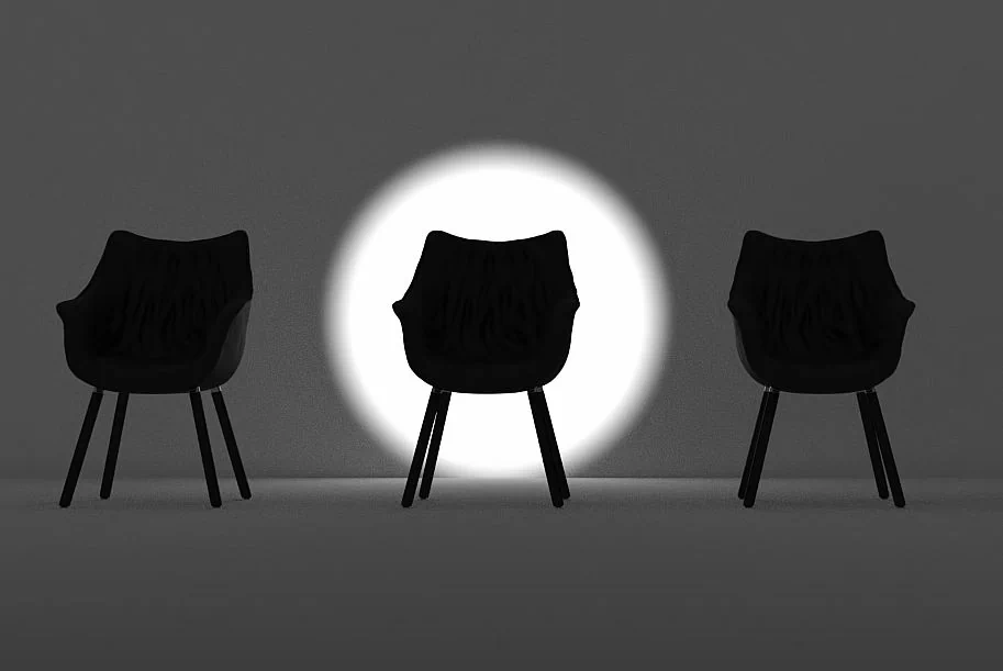
In a more direct example, let’s have a look at four chairs. Now I will have no idea which chair you’re looking at right now, because they’re all exactly identical. There’s no reason you should focus on any particular one. An image like this is likely to get rejected by your brain, because there’s no point to it. So you just turn your head away. However, if you had to make something that stands out, it completely changes the dynamic of the scene. This is just a really simple example of adding saturation to it. But this is really what it’s all about in your scene. It is making something which stands out from the rest of the scene. It’s so important. If you don’t have it, it’s just a complete failure. So this is saturation, but there’s a variety of other ways.
When contrast is used incorrectly
I’ll give you one more example here. And that is contrast. And this is one you see a lot, particularly used incorrectly.
This is what you have to be wary of because high contrast, basically white and black, sitting next to each other is really like a magnet for your eye. You just look at it, right? You have to be wary of it because if you have an interior shot of a lounge room, and then you have a window at the end of the scene with bright white light coming in. The window is got the most contrast in the entire scene. So your eyes are gonna be drawn to the window, when an actual fact is that you want people to look at the couch. So you have to be wary of contrast, which is incorrectly using a scene, because that can become the focal element, even though you didn’t want it to.
Top 5 Focal Elements
There’ are a few natural focal elements.
- High contrast
- Saturation.
- Camera focus, which is whatever the camera is focused on the rest of its blurry.
- If the rest of the scene is static and then you’ve got something which is leaping through it, that’s definitely going to bring some attention.
- Faces or figures. Human figures or a human face, your attention is going to be drawn to that.
Three Important Focal Element Factors
You can actually add focal element factors to a scene to draw focus to it, such as:
- Guiding lines,
- Framing, such as a vignette or a natural frame
- Shapes are like rectangles, triangles, circles, things like that. Your eyes are drawn to geometric shapes as well.
Let’s look at a few examples in detail.
Example 1: A Great Example of Focal Element Done Well
This one here is a great example of a focal element done well. Your eye is drawn to her face, not only because it’s a face. Humans are good at recognizing and automatically focusing on faces. But there’s also some really subliminal methods used here to make sure your attention is focused on the face.

Moreover, the lips of her are red. That’s the only place that red is used in the entire image. That’s saturation. You’ve also got heavy contrast against her cheek there, against the dark backgrounds. You’ve got extra lighting, making sure the focuses on there.
And something which you might not have noticed is subliminal guiding lines. This is something that photographers look for a lot. But as CG artists, we have ultimate control. We should be making use of this more. It’s essentially lines, curves, shapes. But that basically has a line to it, that subliminally directs your eye to something that you are trying to direct the view. In this case, this artist has used this flowing floral, sort of circle around to subtly guide your attention to her face. The guiding line is very clever, really well used. And as you can see, it’s pull off nicely.
Example 2: Another Example
Another example here. I would say on a limb that your attention is focused on this guy right here. So there are a number of things here, which are guiding you to him.
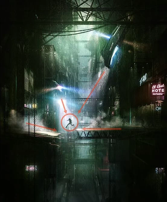
1. The first is high contrast. He is a silhouette. He’s black against white.
2. Second, he’s a figure. Humans very good at identifying other figures. He’s that’s another reason your eyes drawn to him.
3. Third, it is these guiding lines, which you might not have noticed, but the spotlights are all pointing down, making sure your focus is on that guy there.
4. Forth, as well as that, you’ve also got the motion of him. He’s jumping out of the rest of the scene, everything else is stationary, except for him.
5. Fifth, you’ve also got some framing such as the vignette around the edge there, which is making sure your attention is brought.
Example 3:
This one I love, there’s so many elements here at play, making sure that your focus is on that house at the end there.
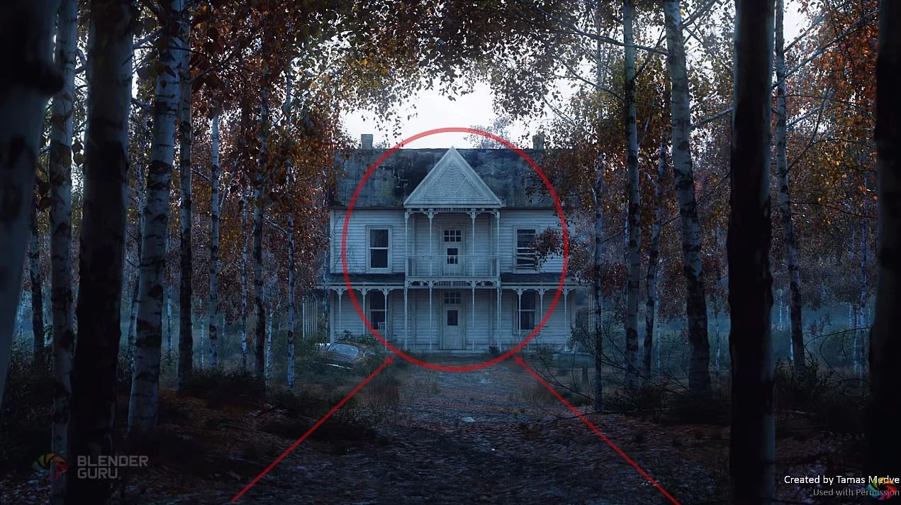
The biggest focal element is the road, which are super easy and really effective at guiding your attention. It’s a guiding line, essentially. So roads, pathways, rivers, things like that are all guiding lines. And having this road leads directly up to the house at this end. It is a perfect way to make sure everybody’s attention stays there, but not just that.
It’s also using symmetry. It’s mirrored basically on both sides, making sure that essentially with cemetery your eyes and then drawn to the center of the mirror, which in this case is the house which is great. It’s also making use of repetition. All of those trees there, that rhythm of the trees access a guiding line. It’s also visually pleasing having repetition in there. As well as that, you’ve also got a really strong use of framing, which is the trees around the outside. It directs you pretty much to the only area of contrast in the whole scene, which is the house itself.
So it’s specifically, the top of the house, you’ve got heavy contrast against the sky. You’ve also got geometric shapes, which I mentioned before, squares, rectangle, as well as the triangle. The only place in the same way you’ll see geometric shapes and the camera focus as well. So lots of elements there making sure the focus is kept on the house, really, really clever.
Example 4: A bad image with 2 focal points
Here is an example of a focal element done badly. This is a great example of why it doesn’t work, because you’ve essentially now got two elements, which are fighting for your attention at the same time.
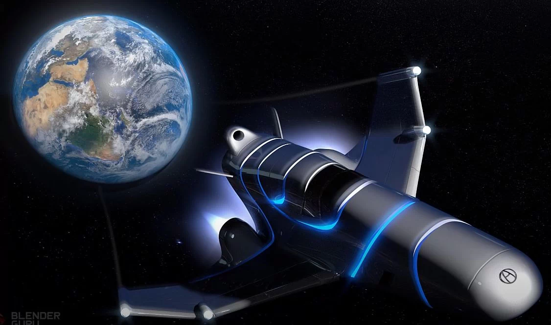
We’ve got this spaceship here, which is zooming towards the camera. And there’s been a motion there. Bright contrast, everything like that. But as well as that, you’ve got the earth, which is completely in focus. It’s heavily saturated. It’s got a lot of contrast you to the texture, and it’s familiar to us. Therefore, we’re drawn to that as well. Now there are two elements equally important, both fighting for your attention. It’s irritating to look at an image like this, just isn’t pleasing. It’s just not fun. This is an example of how it can fail. Therefore, make sure you have just one focal element. And that will result in a much more visually pleasing image.
Structure
Moving on, let’s talk about the second stage for composition, which is the structure. And this is what most people think of when they think of composition. Structure is essentially the organization of the elements in the scene based on a rule.
The rule of thirds is one everybody knows. That’s an example of structure. But I want to stress the point that it doesn’t matter what structure you use, any structure is better than none at all.
For example, let’s have a look at this just random bunch of chairs in no particular order. It’s very displeasing. Your mind basically rejects it immediately, because you’re not sure what to focus on this. There’s no clear indicators as to what the point of the images, just a bunch of random chairs. It’s just irritating, right?
On the other hand, let’s look at this. Now this doesn’t fit into any one of good photography principles, but you’ll agree that it’s much more pleasing. Then this is anarchy, chaos. There’s no order. There is order in this one.
Let’s have some other examples. This is just random, but it’s better than nothing, as opposed to the randomness. So anything will work better than just having a random looking scene.
That’s what I wanted to stress here.
Let’s talk about the common structures in the photography books.
- Rule of thirds,
- Golden ratio,
- Pyramid,
- Symmetry
- Full frame.
Then let’s go over these in detail.
Rule of thirds
The first one is rule of thirds. Essentially, it’s cutting the image into thirds, only horizontal and the vertical axis. And then where those lines intersect, there are 4 points of intersection. You can see here with these circles. You essentially place something of importance there. So if you’ve got a character, you place their face right there. And often it’s good to counter that.
If you’ve got a face that’s drawn here, you obviously want to counter it by having something on the opposing. This is the rule of thirds. And it works really well. It’s essentially a simplification of the golden ratio, which is a little bit more complex. But it works really well. It’s used a lot in movies and tv shows. And it’s just great if you have a character and you want to show the rest of the same.
Here’s some examples. You can see with the rule of thirds overlay here. You can see perfectly lining up. You’ve got the explosion point almost exactly on that intersection there.
The good thing about having rule of thirds for this kind of shot is that you’re now able to see the rest of the scene. It’s not just an explosion by itself. It’s a city surrounding it. It is a whole. You can add the rest of the story to it. And it works well for this type of thing.
Another one right here, add the rule of thirds over to that. And you can see the cat’s face there. The main character, the main point of focus for the scene, is almost lining up with that intersection there. Now it’s not lining up exactly, but it’s close. That’s the thing. You don’t need to become a slave and make sure everything’s perfectly lined up like in the bridge of the nose. That will help, I guess. But it’s not essential. It’s just enough to have it near it and get sort of the basic, broad strokes of the scene.
You can see what’s more important is you’ve got the cat there, but you’ve also got this really high element of visual interest, which is the meal, the seafood itself. So it works really, really well.
Here’s an example of some photography by the US army. And I’m almost certain this was cropped deliberately. It lines up beautifully with the rule of thirds. As you can see, it’s just a visually pleasing image.
The rule of thirds is also used a lot in movies and tv shows because it’s perfect for characters. It allows you to see not only the characters relation to the environment around them, but also are great for dialogue because it allows the two characters to face each other or face off camera. I have a discussion. It’s just a really powerful technique in keeping an aesthetic shot whilst also are continuing to tell the story.
Golden Ratio
Next up, let’s talk about the golden ratio. Everybody has heard of the golden ratio, but almost nobody knows what it’s for. There’s a whole bunch of myths about it. It’s just naturally going to make things look amazing. Essentially, the story behind the golden ratio is everywhere in nature. You will find instances of the golden ratio being present, such as in seashells, you’ll find it in nature like plants and flowers and things like that, as well as the other gravity around planets. It’s very interesting. A lot of people come up to theories as to why this exact ratio works in the real world. It’s just there.
Because of that, some designers have taken that design theory and influence their designs because of it. The iPod made use of it, and famously the actual violin was designed because of it.
Essentially, it does work, and it has been proven through a lot of designs to work well.
Here are some examples. This beautiful image here is by James Gardner. It is pretty much lining up exactly with the golden spiral, the golden ratio. How do you want to call it? I’m almost certain that was not an accident. Now this could have been done with the rule of thirds and it probably would have looked just as nicely. But it’s using the golden ratio and it has a really striking result. You can see the other jellyfish sort of wrap around the spiral as well. It’s a great result.
Here’s another example here. At first, I thought this one was using the rule of thirds. But put the golden ratio over, you can see that it lines up pretty much spot on with that. So the main focal point is that jet, which is flying out from the camera. And you can see that towards the top here, specifically where this building is, you can see these wraps around almost exactly with that spiral there, which leads me to believe that this was fairly deliberate. And it creates a very nice pleasing looking image.
That’s essentially the golden ratio, but I do want to stress. Don’t think that implementing the golden ratio thinking will make your image look amazing instantly, because there are countless designs using the golden ratio, which is just looking terrible. Therefore, it’s just not an indoor bill, but if your design allows for something like that and you think it could work, give it a try and it might look pleasing. But anyways, it’s a structure. One of many that you can use.
Pyramid Composition
Another one is the pyramid composition. This is one that few people talk about, but it’s very effective, especially for things like characters. It allows you essentially to create a striking figure.
So it’s used a lot for characters. And like in comic books, you have superman standing above the camera and it is getting small towards the top. Maybe it looks like a towering looking appearance. So it works really well for single subjects such as characters. But it also works well in wider scenes as well. It’s a little bit more difficult. It can come across there as well.
Symmetry
Another one we’ll talk about is symmetry. This is mirroring something along the horizontal or vertical axis. It is very simple, easy to come across. You’ll see this a lot in architecture, particularly for buildings, such as mosques, churches, and government buildings, because having symmetry results in a powerful and important building look. So that’s what symmetry does. And that’s why it’s used so much for churches, mosques, and parliament buildings.

That’s an example here. The Taj Mahal obviously mirrored along the left and right. And then we’ve got one here going vertically. So this works really well for reflections. And it creates a really striking pleasing looking image.
Full Frame
Finally, the last one is full frame. This one is so basic. You almost don’t need an explanation for it. You have a single subject, just zoom in right on that subject. You can leave a little space around it, or you can just have it. Zoomed in like that’s called full frame, no other competition element, because it’s just one thing. You don’t need to confuse things by putting rule of thirds or in that stuff in there, just full frame. That’s it. That is structure.
Balance
Last of all, we’ll talk about the balance. It is all about ensuring that the visual weight of the image is evenly displaced, making sure that you don’t have something that so heavy on the left hand side or up top or whatever.
As an example, this is a very unbalanced scene.
We’ve got this very dark contrasted chair on the right-hand side there, and nothing on the left-hand side. If this image had weight to it and it was sitting on a scale, it’ll be leaning to the right-hand side. It works as if the real weight is involved. If you can imagine there’s a line down the center here, it’s essentially like that becomes the fulcrum. So you need to have something to balance that out. And the smaller it is than the further you pull it out, too.
But in any case, we’ve now just got one giant object here on the right hand side, way too heavy and nothing on the left hand side. So you wouldn’t wanna have this sort of orientation in your image. But if you did, you need to balance it by putting something like a little chair on the left hand side there. And now that becomes a balanced composition. You wouldn’t do that, though. You just focus entirely on the chair and crop it right down. But if you were to go with this exact proportion to see what you have to do, that’s essentially balance in a nutshell. It’s ensuring that the weight is balanced.
When we talk about visual weight, we’re essentially talking about the things we mentioned with the focal elements. Visual weights include:
- Size,
- High contrasting elements,
- Saturation that adds more visual weight to things,
- Faces, a huge point of visual weight.
- Figures, the body figures as well.
All these things add lots of weight to an image, which needs to balance that out. Here’s an example of an unbalanced image. I completed this image a year or two ago. Your attention is drawn right over here to this building where there’s this bright light, so much bright contrast over here, as well as a figure which adds to it as well. And then not much on the right-hand side.
Now you might think we’ve got somethings here. We’ve got some paper printed boxes or corrugated printed boxes, whatever. But it’s not as bright. So a great way to check if it’s balanced is to decrease the values of light in your image. Then it turns up the contrast. When you do that, you can see that you got this big, bright patch on the left-hand side there. If you also turn up the blur in this value, you can see very clearly that it’s very unbalanced.
So this is essentially what’s called the squint test. If you squint your eyes, you essentially get this result. And you can try that with any image. And that’s just if you’re going decrease the brightness of things, we also gonna include things and remember things like saturation the faces, characters, things like that. They can also add extra weight.
But in this instance, if you wanted to balance this out, he would essentially need to put something around about here. Maybe a red engine, an extra lamp or something like that to counter that extremely bright weight over there. That would essentially do the trick. So that’s what is needed.
Here’s a better example, a more recent one. You’ve got this extremely bright crystal gem in the foreground there in a very dark surrounding. Now this would be really bad. It’s a really bad way to completely unbalance the same. But to counter that, in the background over here, we got old jimmy hiker standing in the cave entrance as a silhouette against the sky background. Meantime, he’s a figure, which adds a certain amount of weight to it as well.
So much weight that it counters against this brightness in the foreground there, without him there, this would be drastically unbalanced. But with him there, the fact is that he’s got so much weight as well, visually, it helps to balance that out. Hoping that makes sense.
Another example here, we’ve got a really large, huge looking monster dude, which would usually throw the image out of balance. But we have another character, a human girl, which has a lot of visual weight to it as well, which balances him out.
As well as that, you’ve got a bright window up there against the moon. There is a lot of contrast there, which would make this scene a little bit unbalanced, if it weren’t for this lamp shade down there.
Now, this is a complex example. And if you’re looking at this and thinking like, I don’t figure, I don’t know this. I can’t figure this out like this. Exact signs of bouncing this and that, and luminous and contrast and saturation. Don’t worry about it. It’s something that you will pick up as you go. So even though this might look confusing, like you don’t understand all of this stuff just yet, the more you work with it, you automatically begin to start implementing this stuff in your scene. So you’ll add a person, and then you’ll go, I need to add a little custom paper box over here to the right-hand side. You’ll just immediately instinctively start adding this stuff.
This is the best example I can think of for a balanced scene right here. We’ve got this obviously giant, demanding, scary looking robot with a huge, bright shining light. It’s a camera tart, which has got a lot of weight to it, heaps of weight. However, on the left-hand side here, we’ve got a little boy. He is a figure as humans were instinctively drawn to figurines. He has a lot of weight, even though he’s not as bright and contrast as the robot is. He is a silhouette. Therefore, he really acts as a really great balancing point for that giant robot there. As well as that, we’ve got this huge overpass over the top there, which would act to balance this. This cleverly placed shadow across the ground there, as you can see, is a really deliberate and brilliant way of balancing a really complex scene.
That is balance.